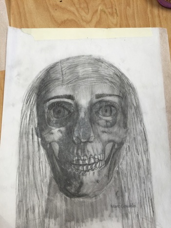
This was extremely challenging because it merged all the components of drawing work into one project. The drawing was really large and I don't really like to work large, also there are so many details that go into a person other that take so much time. I don't like the way this turned out, it doesn't really look like the person I drew and it's really off proportion. I think that the eye rule for someone's head it smart, but it's really hard to actually capture that in a person when you're working large scale. I really wish this had turned out better. I truly like the idea of a full figure drawing but it is really hard to accomplish. Another thing I struggled with was fully seeing my model constantly. It's hard to have them stay completely still the whole time you're drawing them.
Best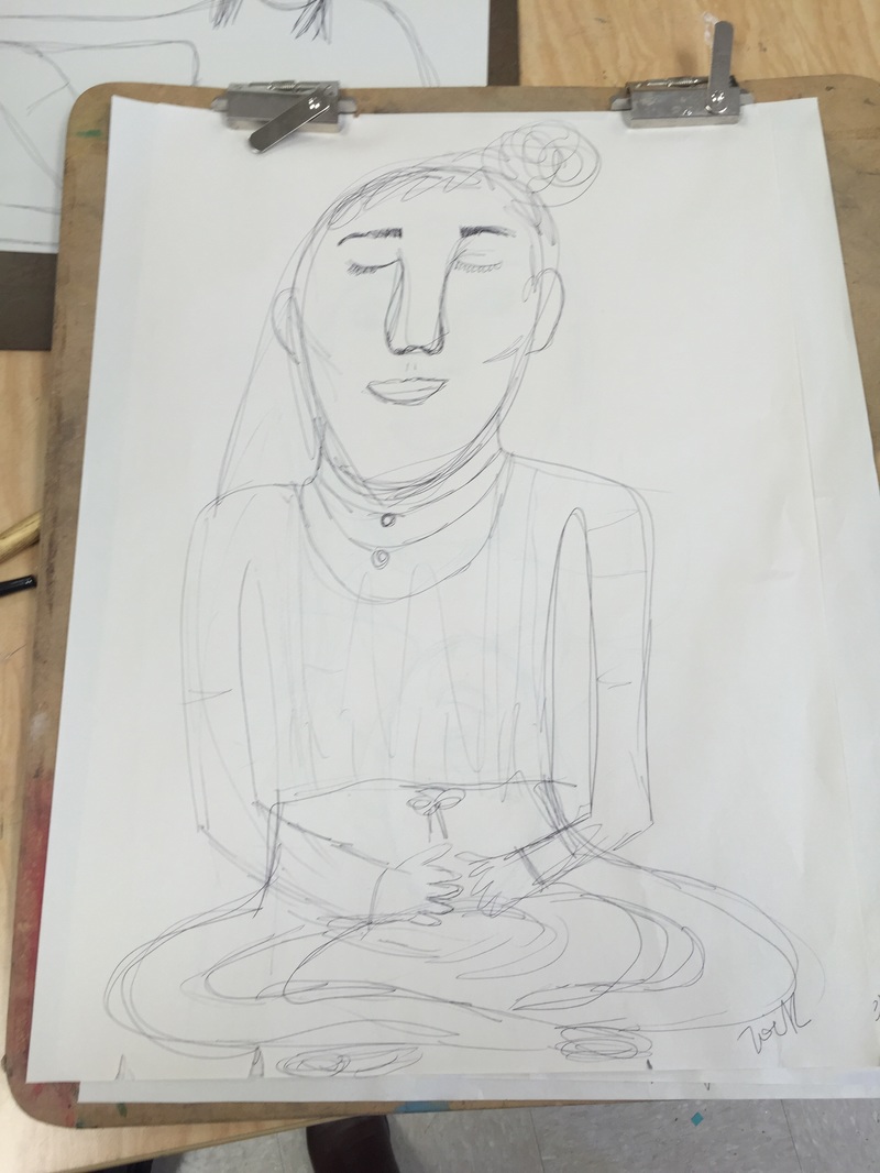 For me I thought the gesture drawings were fun, but challenging. Sometimes when I try to draw something in real life I get a very sketchy style and it makes it look bad, but this was one my later drawings and I like the way it came out, I think it really captured the movement that was happening at that time. Worst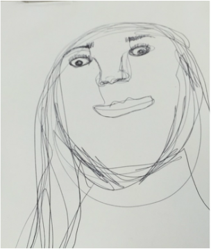 This is my worst for obvious reasons, it was the first one a I did and was supposed to be a sketch of the person sitting across from me. I didn't realize that I was supposed to capture her body and the movement (GESTURE) she was making. Again, this is really sketchy like I said before.
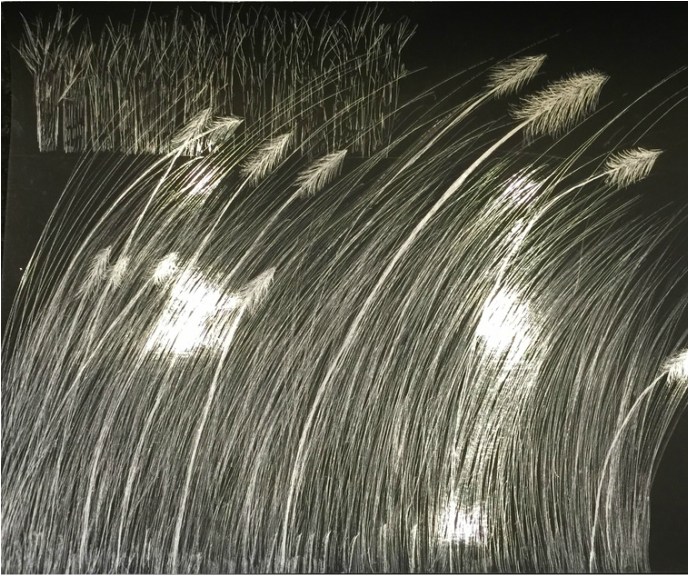 My scratchboard was another project that I liked, I really like the way grasses and prairies look and I really feel like they show a lot of movement. The idea of scratching to reveal white/silver is really cool and reminds me of my childhood when I would scratch a black board to reveal a rainbow color in the back. This was a lot harder. It was a lot like pen and ink in the sense that you cannot remove what you put down, this was hard because I was so used to pencil where I can erase everything that I put on the paper. During our class critic it was pointed out that I should've added more vibrant whites and more highlights, I agree. If I would do this again I would have some fawns (things on the top) that were super zoomed in and large and very white. Overall I liked scratchboard and I would love to have done more with it.
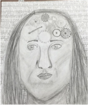
I am on the fence about how I feel about this project. I never thought that I could draw a portrait, but I did. One thing that bothers me about this portrait is the fact that it does not look like me at all- which was really the meaning of the whole project. My whole idea or theme around this project is that just because people don't talk a lot doesn't mean that they have nothing to say. This doesn't really apply to me, but I think it is just an interesting thought in general. Not voicing our opinions doesn't mean that we don't have them. At first the drawing didn't have a mouth, just stitches, but they looked really strange and made the whole drawing seem really "off", so I added lips, and I was going to stitch them up, but I decided to just leave them. If I could change some things about this project I would probably make it look more like me and I would fix the hair. The background is okay, it started with just a simple stripe background, but it looked like a mug shot, so I added words which I think add to the message of the project which was hard to see without the letters. I also messed up the chin. Ugh, it's okay.
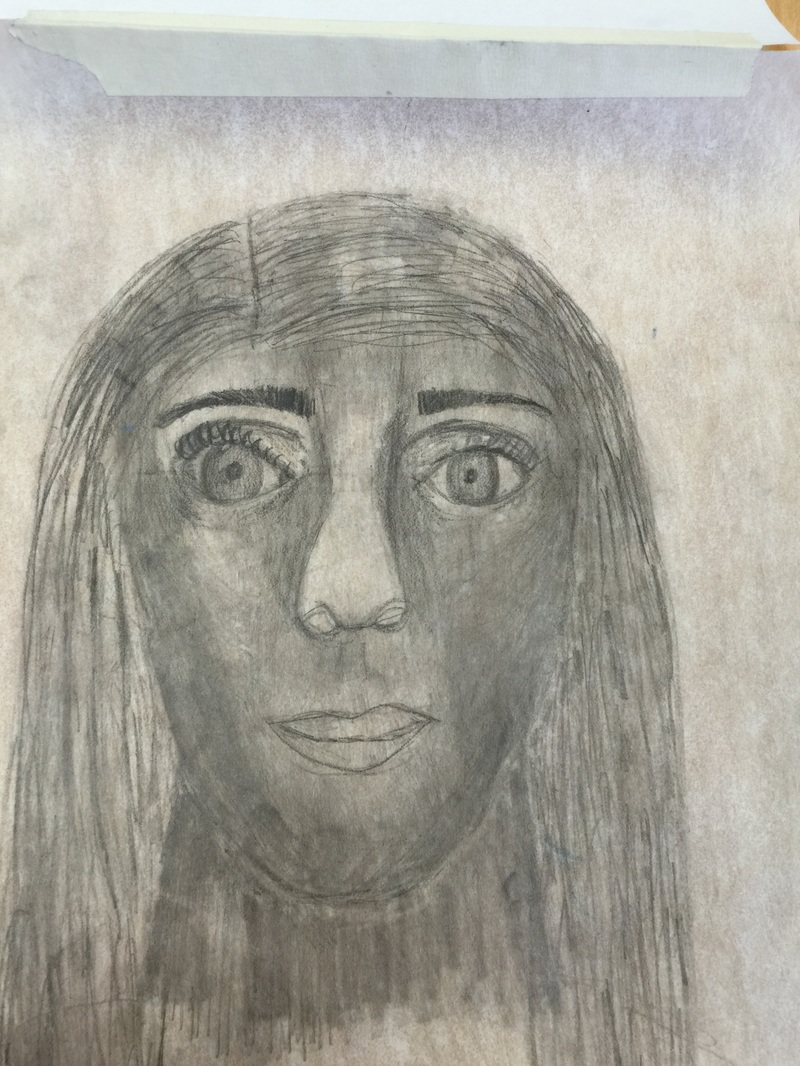
I really do not like this one bit, I think it is the ugliest thing I have ever seen and I do not want to be affiliated with it. The nose looks horrible and the lips look too small and I didn't shade them. The hair is too stringy and I didn't make the lines run from the part all the way to the end, making it look really strange.
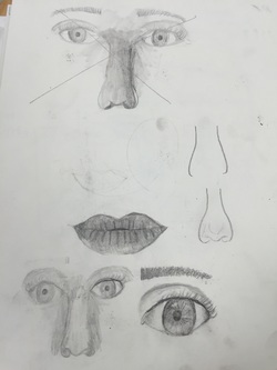
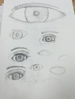
Above are the sketches for my eyes, nose and lips. I really had a struggle with the shapes of the lips and noses. I got one really good pair of lips and I sort of practiced more and more with the eye and got a better shape. The large eye on the top is the first eye I drew and on the left picture the bottom eyes are the most recent, I have clearly improved....
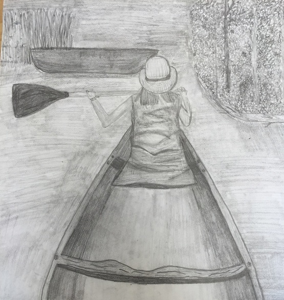 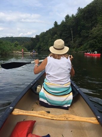 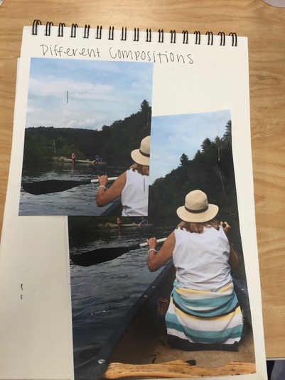 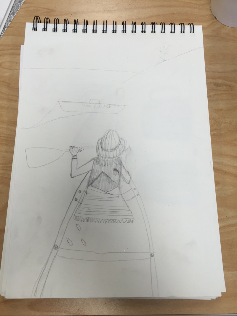 I personally love the way this drawing turned out, I really took my time instead of rushing like I always do. The hardest part of this drawing was definitely the trees. It was hard to draw them realistic when they were so far away, in the end I just made a bunch of squiggles and leave-like shapes, which took a long time. If I could change one thing I would definitely not include the canoe. I think that the canoe made it look weird and off balance. Also the canoe is not even realistic and made the whole drawing seem unrealistic. Overall I really like the way this one turned out and I think it's one of my better ones. I have definitely come a long way in my drawing skills.
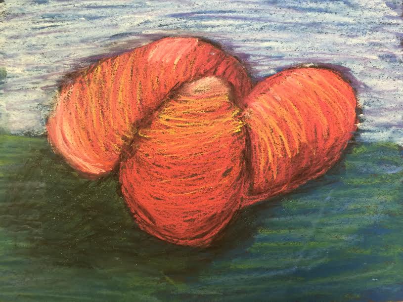 I personally really like these eggs. I like the background I used, I like the colors I used and I actually really liked working with the chalk. One thing I liked about working with chalk is that it is easy to go fast, it took me atleast 10 minutes to finish this drawing and I actually like it. I really like the look of textured chalk as opposed to smooth chalk. Last year when I worked with chalk I would tend to overblend and then it would quickly become messy. So this year when I worked on it I really wanted to make sure that I used the chalk lightly and didn't blend at all. One thing I learned about chalk is that it layers really well. One technique I used is instead of putting down highlights first, like what you would do with prisma colors, I put down the black first, when I put down the black first it would keep me from having to blend it into the colors later.
Dum Dum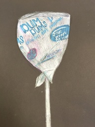 I did this project last year, in art 2. I personally feel like this one is alright. One thing I really wish I had done was add more colors into the wrapper instead of keeping it a bright white. For me, using colors other than the ones that I see is hard because I focus too much on making it realistic. I think I rushed this project too much and I hate when I do that. Overall, I like it, there are just a couple things I would do differently, I would make the picture of the flavor (blue rasberries) a little bit larger just because I think it would make the wrapper look like it has more on it. I would also work on the folds around the stick to make them look more like they are wrapped not just sticking out. Jolly Rancher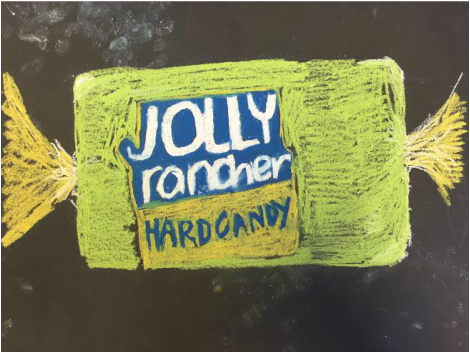 I do not like this jolly rancher at all. I was sick one of the days we worked on it and I didn't get to finish it and instead of leaving it undone I just rushed through it and put a bunch of green in it. I actually liked working with the chalk and the idea of drawing a jolly rancher and I personally just wish that I hadn't of rushed. One thing that I do like in this piece is the lettering, I think it looks realistic, especially compared to the rest of the drawing.
|
Archives
January 2016
Categories |
 RSS Feed
