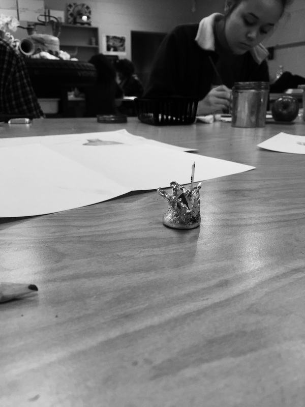
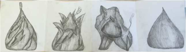
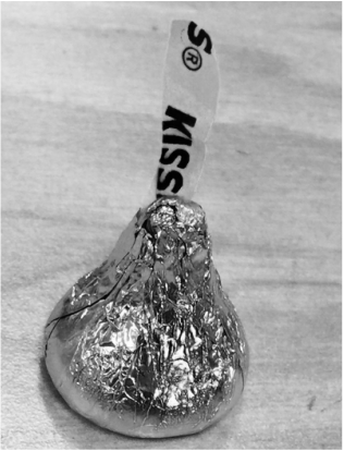
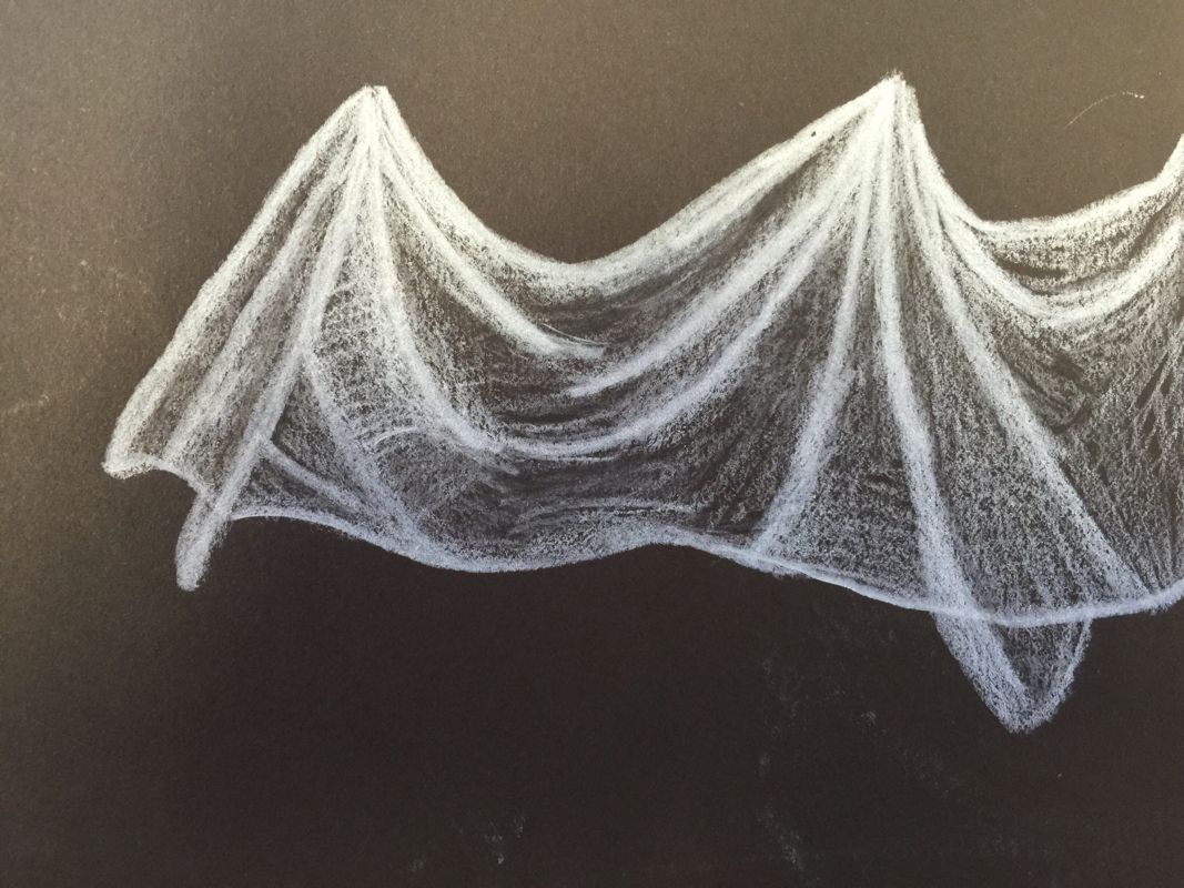
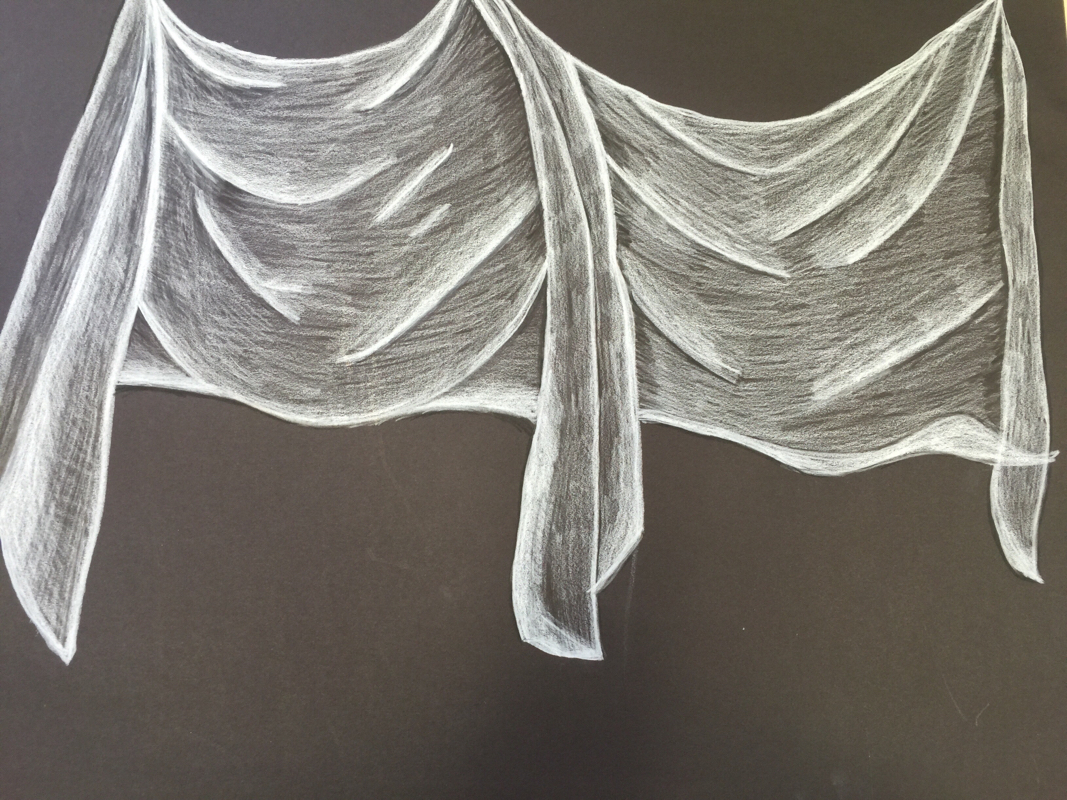
I really wish these turned out better. I honestly really hate the way they turned out, I think that by themselves they look good, but when they are all put together they don't look like they are all from the same kiss. It was really hard to match the shape of a kiss. It's a strange shape, and it's hard to master. I have never really been good at drawing things to scale, I either want to draw super small, or super large. If I could change something, I would focus on the shape of the kiss so that looks more uniform, I would also pay better attention to the second to last drawing, the one where it's sort of unwrapped, the sizing is off, therefor it makes the whole piece look off. I would also do better shading on the last drawing. I think that it looks nothing like a kiss, but instead a random shape.
0 Comments
Still Life Sketch Still Life Final Starting a still life was really stressful, I didn't know where to start or how to make it look realistic. A lot of the things that I was wanted to draw, included things that I didn't want to draw. I must have started over, erased, and changed compositions a million times. This was really overwhelming, but I think this is one of the better things I've ever drawn. I actually really like the way it turned out. I enjoy drawing fabric and I think this fabric turned out good, however if I did it again I would try to include more value in the different folds and the shapes of the fabric. I would take my time and include more values. I like the way the burlap turned out and I love the way the basket turned out, even though it took forever. If I had more time and patience, I would've gone into the wood and added more values, marks and wood like qualities. If I could change once part about my drawing it would be the flower, I don't think it looks realistic compared to the other elements of the drawing. Another thing I would probably do differently is not going too dark. One thing I think has improved immensely over the course of still life is my ability to draw from what I see, not what I think I see (I learned this through the basket!!) and also my shading has improved. Overall I think this piece turned out really good.
Ribbon Sketches *Forgot to take pictures- pictures to come* Final Color Ribbon The ribbons were the hardest to draw, I didn't really understand the way to portray how they appear in real life. After working on our still life and the fabric, I better understand this concept of making the ribbon thin when it's folded. Recently while working on my Hersey Kiss drawing I've noticed that my drawing of the Kisses ribbon is looking a lot better than my first ribbons. If I could do this again, I would. Fabric Sketches Final Fabric I actually think my fabric looks good, I liked drawing this, at first it was overwhelming, but after a while I sort of got the hang of pushing values and creating dimension. I think the hardest thing for me when I'm drawing fabric or things with texture/wrinkles, is creating them with my shading. I don't pay attention to the dark spots and the highlights and I look more at the shapes. If I could do this again I would take my time, I would look at it piece by piece instead of one whole drawing. One thing I think this project taught me was to push the values instead of making lines as my dark spots, I've realized that things don't go from one extreme to the other, it takes time to transition. Blind Contour Hand This is one of my first couple hand contour drawings. This one was done without looking at the paper and using pen. This was different than anything I have done before, most of the time I pay more attention to how I think things should look and how they look on the paper as opposed to in real life. I think I did a pretty good job on this, it was hard to get the placing of the fingers (the pinky). I like the way contour looks and I think I will use it in future pieces. Modified Hand Contour I think this one actually looks worse. I was paying too much attention to what I think a hand looks like and less about what my hand looks like. I got the sizing and the placing a little bit better, but I missed the details that I noticed when I did it blind. I liked the way this looked to an extent. I like the idea of sketchy, rough drawings, but I like more detail in them. I feel like this piece lacked detail and real definition. If I were to do this again I would go slower and pay attention to what I see. Often times in art I get overwhelmed by what I'm drawing and how much paper I have to fill. If I were to do this again I would work in sections of the paper and take it line by line. BackPack Contour The backpack drawing was a lot different than the room, back packs are more defined and have more 3D components. The backpack was laying on its back, which I thought made it harder to draw. There was a lot of shadow that I wanted to add in, but it was hard to do it when contouring. If I were to do it again, I would spend more time on seperate parts and add in details. HW: Contour Plant Drawing 8/29-8/30 For this homework assignment I really struggled with gettin the detail of the plant into the drawing without it looking like a bunch of lines. We have a lot of plants and flowers in mason jars in my house so I had a lot to work with. I did a lot of sketches, none of them really turned out the way I wanted it to. Drawing glass without shading looks weird. These turned out horrible. At first they didn't look that bad, but after being smudged in my sketch book for a while they look even worse than before. If I did this again I would put more effort in to it, and blend the color more gradually. 6B and HB Value Chart White Charcoal and Chalk Value Chart This is a value chart using 6B and HB pencils Value chart using charcoal and colored pencils |
Archives
January 2016
Categories |