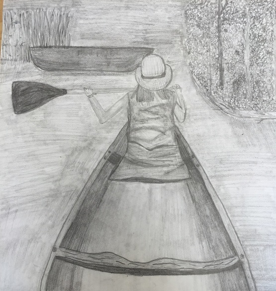
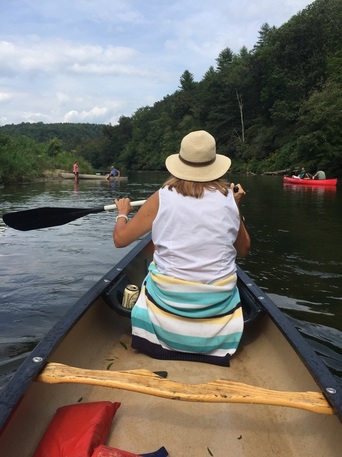
I personally love the way this drawing turned out, I really took my time instead of rushing like I always do. The hardest part of this drawing was definitely the trees. It was hard to draw them realistic when they were so far away, in the end I just made a bunch of squiggles and leave-like shapes, which took a long time. If I could change one thing I would definitely not include the canoe. I think that the canoe made it look weird and off balance. Also the canoe is not even realistic and made the whole drawing seem unrealistic. Overall I really like the way this one turned out and I think it's one of my better ones. I have definitely come a long way in my drawing skills.
I personally really like these eggs. I like the background I used, I like the colors I used and I actually really liked working with the chalk. One thing I liked about working with chalk is that it is easy to go fast, it took me atleast 10 minutes to finish this drawing and I actually like it. I really like the look of textured chalk as opposed to smooth chalk. Last year when I worked with chalk I would tend to overblend and then it would quickly become messy. So this year when I worked on it I really wanted to make sure that I used the chalk lightly and didn't blend at all. One thing I learned about chalk is that it layers really well. One technique I used is instead of putting down highlights first, like what you would do with prisma colors, I put down the black first, when I put down the black first it would keep me from having to blend it into the colors later.
Dum DumI did this project last year, in art 2. I personally feel like this one is alright. One thing I really wish I had done was add more colors into the wrapper instead of keeping it a bright white. For me, using colors other than the ones that I see is hard because I focus too much on making it realistic. I think I rushed this project too much and I hate when I do that. Overall, I like it, there are just a couple things I would do differently, I would make the picture of the flavor (blue rasberries) a little bit larger just because I think it would make the wrapper look like it has more on it. I would also work on the folds around the stick to make them look more like they are wrapped not just sticking out. Jolly RancherI do not like this jolly rancher at all. I was sick one of the days we worked on it and I didn't get to finish it and instead of leaving it undone I just rushed through it and put a bunch of green in it. I actually liked working with the chalk and the idea of drawing a jolly rancher and I personally just wish that I hadn't of rushed. One thing that I do like in this piece is the lettering, I think it looks realistic, especially compared to the rest of the drawing.
|
Archives
January 2016
Categories |